HULU REDESIGN
Designed in Figma

PROJECT DESCRIPTION
This project explores the skill of rapid prototyping to simulate a quick client deadline. The task was to choose an existing streaming platform and conduct user testing to analyze frustrations with the interface.

User research conducted on 7 individuals aged 20-25
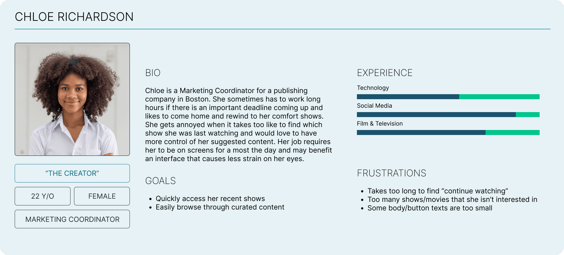
USER PERSONAS

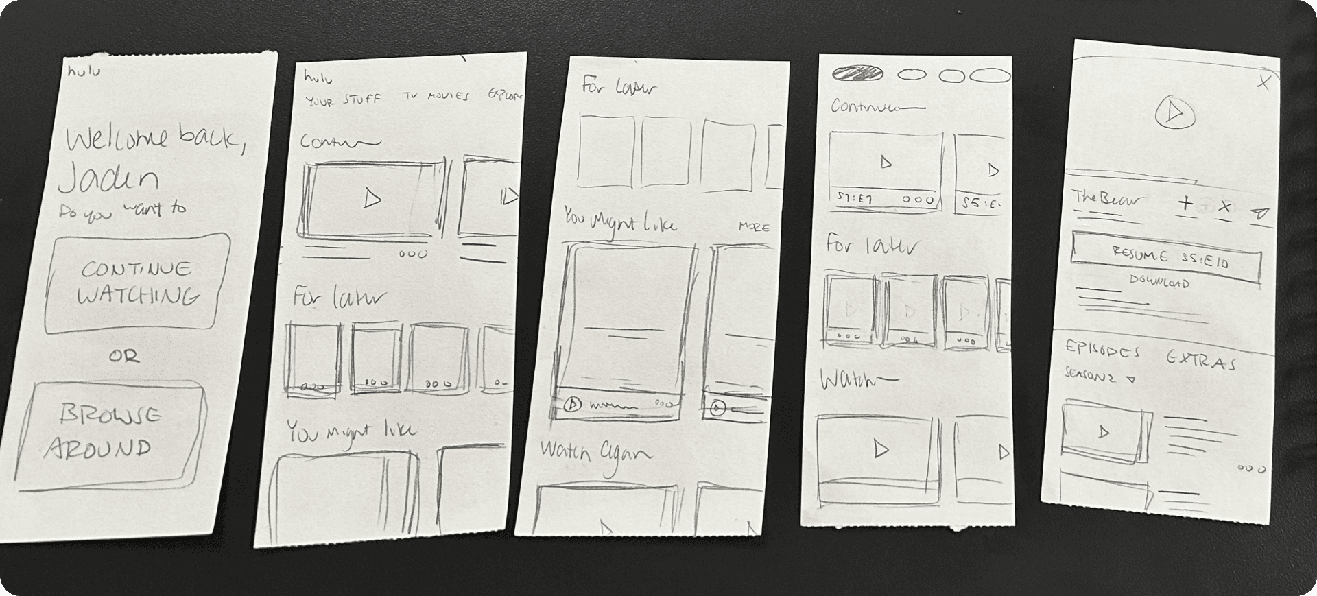
SKETCHES


PAPER PROTOTYPING
BEFORE


AFTER


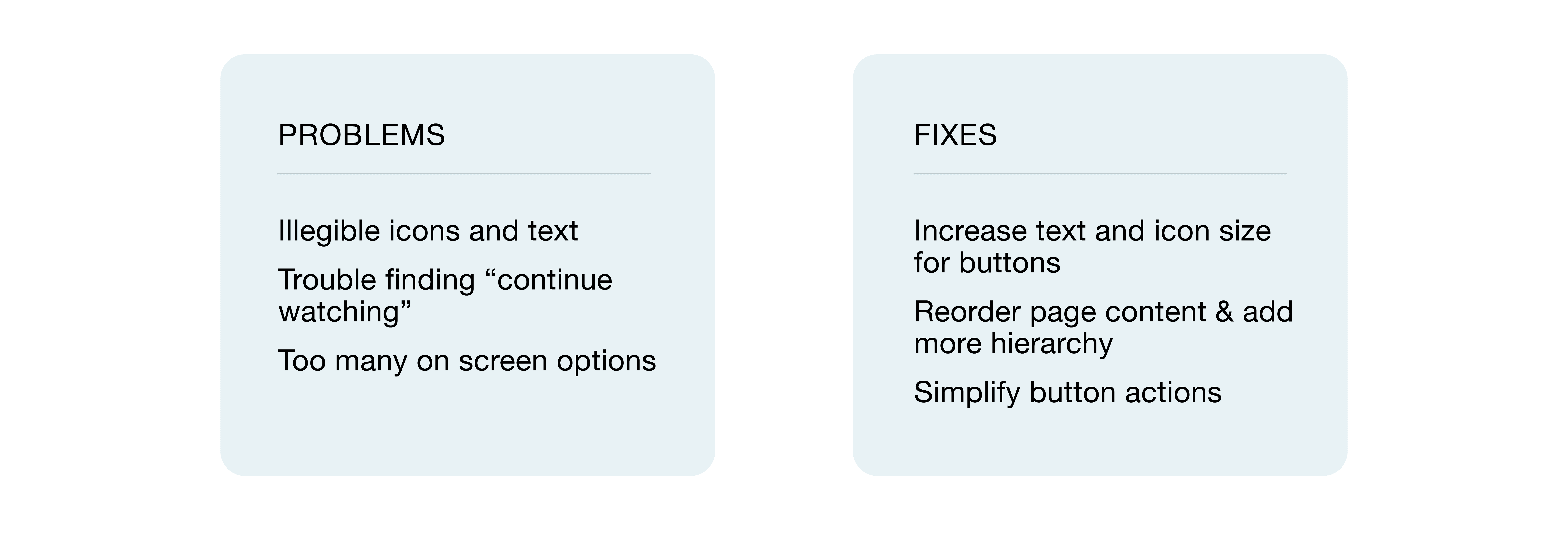
SIMPLIFYING MOBILE
I combined "My Stuff" and "Profile" into one page for more efficiency in terms of navigation and visibility. There was minimal space being used on the profile page and too much being used on the "My Stuff" page. The user would now be able to go to one central location to see their list, recent watches, and account information.

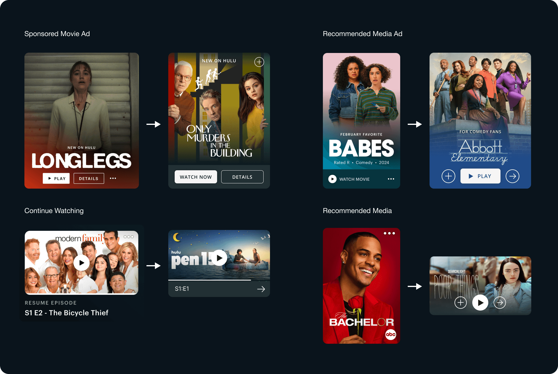
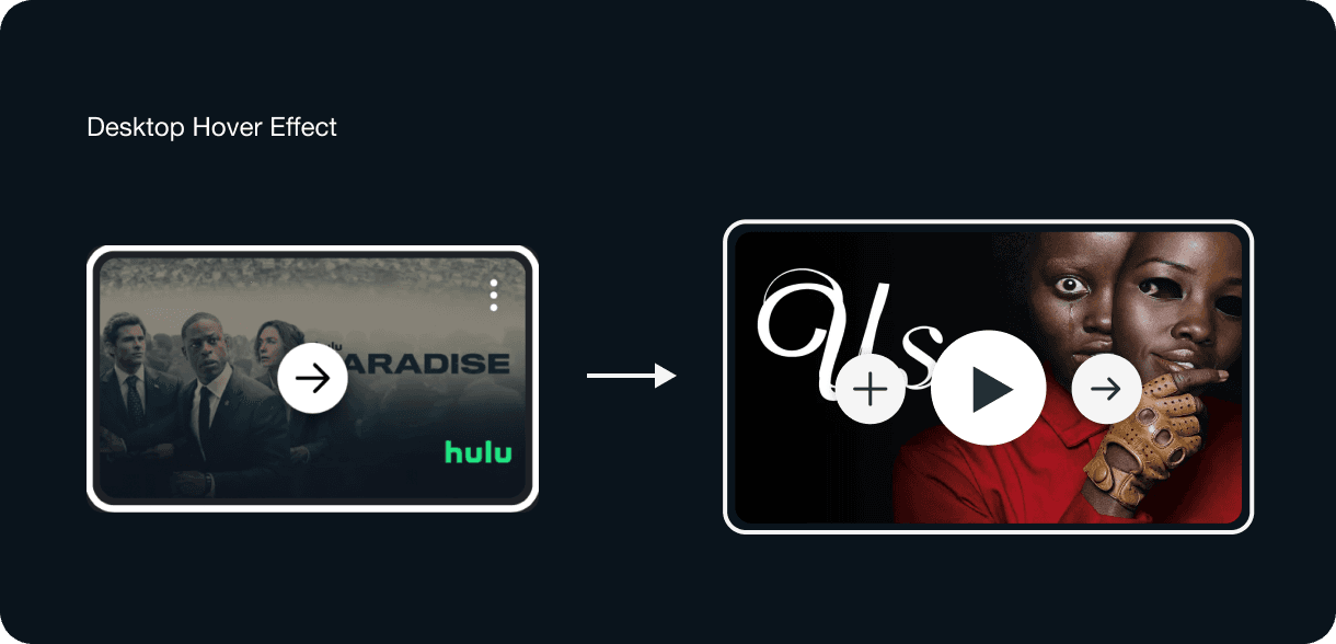
CARD DESIGN (Before & After)