URBAN SOIL

PROJECT DESCRIPTION

This project showcases a semester-long rebranding project that includes a complete brand book along with campaign materials. We were tasked with choosing an existing non-profit campaign to redesign. I have a strong belief that every human should have access to fresh and affordable produce, so I chose the Urban Farming Institute of Boston.

NAME CHANGE

I changed the name Urban Farming Institute of Boston to Urban Soil. This new name is short, relevant, and appeals to a younger target audience. 

LOGO IDEATION

My goal was to combine urban imagery with agriculture to emphasize growth and community

My goal was to combine urban imagery with agriculture to emphasize growth and community

MOODBOARDS

I had two different directions for the brand: one that was bold and vibrant to reach a younger audience and one that a little bit more mature and educational. The client unanimously agreed on the second choice.

Color refinement: deeper, more saturated, and more relative to the farming scene

Color refinement: deeper, more saturated, and more relative to the farming scene

Color refinement: deeper, more saturated, and more relative to the farming scene

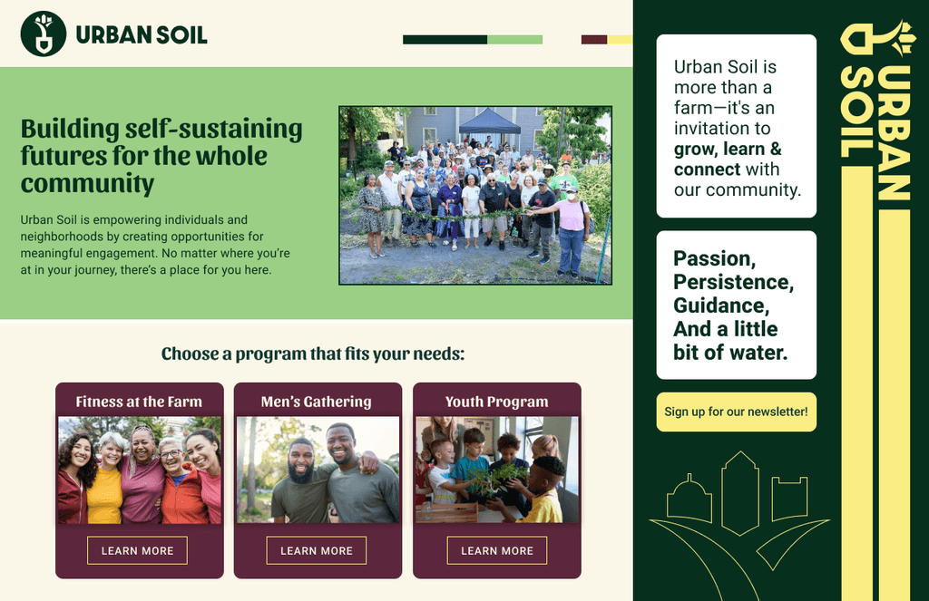
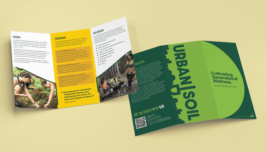
FINAL BRANDING MATERIALS
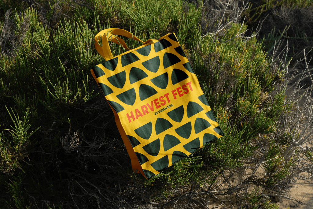
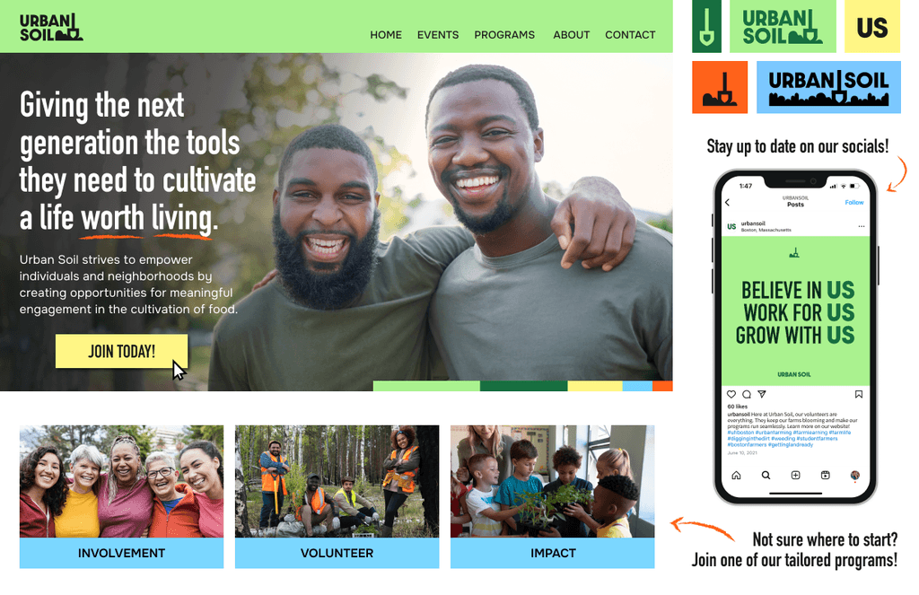
LAUNCH CAMPAIGN

I chose an event launch campaign because this organization already had a history of hosting community events. Harvest Fest felt like the perfect opportunity to connect with a larger audience and inspire community members of all ages.

I chose an event launch campaign because this organization already had a history of hosting community events. Harvest Fest felt like the perfect opportunity to connect with a larger audience and inspire community members of all ages.

View full Urban Soil Brand Book here!

View full Urban Soil Brand Book here!

View full Urban Soil Brand Book here!

Built in Framer

© 2025 Jaden Graham

Built in Framer

© 2025 Jaden Graham

Built in Framer

© 2025 Jaden Graham